With two weeks left in 2020 right before the holiday season, we decided to take a break from some of our usual publishing, development and porting tasks to instead have a little fun. The Akupara Game Jam saw teams of developers, artists, writers, and designers come together to create prototype games and let the imagination of our teams run wild. Today, we’re continuing with our second of three prototypes. You can play the game right now on Itch.io or Gamejolt for free, or you can keep reading to get a little insight from the game’s designer, Joni Ceceri.
The Concept
The pitch of Playmaze Panic (codename PP) is simple: You are a child lost inside a nightmare version of a fast-food indoor playground. Monsters are stalking you on all sides, and you need to collect all the key items to unlock the gate and escape. The concept is a sort of fusion of Five Nights at Freddie’s meets Alien Isolation meets Resident Evil. I originally came up with this game about a year or two ago, way before the jam. Coming hot off of the Resident Evil 2 Remake, I was thinking through the design of the game and realized how simplistic it actually was.
One of the main mechanics is collecting key items for locked doors. The game makes it very easy to find out where items are, often marking any you miss on the in-game map. However, it builds tension up so effectively that you constantly are backtracking when a new monster pops out. Your progress in the game is based solely on your confidence that you can handle whatever just jumped out at you, and anything new or unfamiliar has you running back to where you started. I was fascinated that Resident Evil 2 Remake was so good at its presentation that it makes the entire game seem more complex than it actually was. I put dozens of hours into it and figured out the science of how the game worked, and slowly started putting my own designs together.
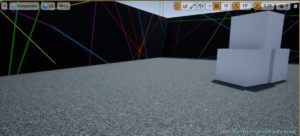
An early environment, taking place in a laser tag arena.
One of the first things I thought through was making a “babyfied” version of the game, where you stripped the game down to its bare components: A locked gate needs items to unlock, but you need to evade a monster to get the items. Unintentionally my mind wandered to a literal child’s playground, where you could put toy blocks into a puzzle wall, and be chased by some distorted childhood horor. It just seemed like a perfect fit.
At the time, I was working as a solo indie dev, mostly prototyping ideas when I was idle. I was playing around with a number of ideas of what each part of the game would look like, but at the end I realized that the problem was I needed to focus more on the assets than the design of the game. After all, I had mostly figured out the core loop of the game, I just needed some believable monsters to make players want to stop playing!
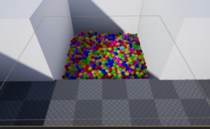
A prototype monster, a living ball pit
Eventually, I put the project aside since I didn’t have the time or ability to focus on making the needed assets, and slowly forgot about it until this jam…
The Jam
When the Akupara Jam was announced, I looked through my backlog of ideas that I never got off the ground to see if there was anything that was worth using. The “Horror playground” concept jumped out to me as something that would be a good fit for a multidisciplinary team. I wrote up a quick pitch for it, and honestly was surprised a lot of people were into it!
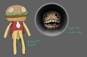
Concept of what became our final monster, Oogaburga
We had a really solid team for the project. Rob Clifford and Estevão Arantes were on code, Mike Shanks was on monster art, Miguel Moran was environment art, and Cat Arthur was audio. I was doing most of the design, and at first I fell into the classic blunder of over-scoping the project. Originally there was going to be three “levels” to the game, where you had to keep climbing up the playground and unlock a slide at the top that would take you to safety. We also would have the playground constantly be shifting, so you would get disoriented easier, along with other obstacles. The first problem we ran into was that most of the team was busy with their own projects, so we spent the first week coming up with the concepts before we actually started working on the code. The second problem was that every mechanic we added needed a lot of asset work. We came into the project with the mindset of “style over substance.” We knew that the game mechanics didn’t need to be complex, we just needed the environment to be.
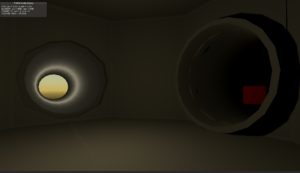
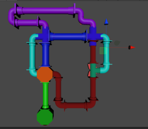
An early version of the tubes. That red cube was our monster for a while!
One of the advantages of the pitch was that I purposely made it open-ended. I really didn’t have a specific game design in mind, only what feelings I wanted the player to experience. To me that meant that we could take out almost anything in the design as long as we got the visuals and audio of the game right. I ironically ended up right back to the basics of the original idea: A locked gate needs items to unlock, but you need to evade a monster to get the items. From there, I was able to make a concise task list of what we needed for the game. Miguel made a bunch of plastic tube parts that I could assemble into a map. Estevão made a basic player controller, monster AI, and the gate/key items system. Mike created the monster sprite while Cat did excellent foley sound effects of a sticky playground tube and a slorping monster noise.
At the actual last minute, everything came together when I assembled the final map with everyone’s contributions. I had decided at that point to scrap the multiple levels idea, and came up with a simple map that looped around on itself. The idea with the map was to have no dead ends, that way the player would always have an escape route. Estevão had actually created a system for the tubes to move around which was functional, but that would have added a lot more complexity than we had to to develop for the map. We found other ways to add challenge to the game however. Items would spawn in random locations, but usually in the same set of tubing. Picking up an item would slow you down, meaning if you ran into the monster you either had to hope you were close enough to the orange safe room, or to drop the item and run.
I added a number of small touches to the game to help build the tension. The monster sprite as it patrols is just a floating burger. Each player’s first encounter with it would be a surprise as it transforms into a horrific gooey mess. One of the earlier designs for the monster had it be a 3D sphere the sprite would wrap around, which if we had time I would have liked to develop for it, but the solution I found works for the prototype. The monster being a 2D sprite also meant that I didn’t have to worry about the direction it was facing. It always is looking at the player which includes its field of vision to hunt them down, meaning sneaking past it. One of the more fun additions I was able to add was the ending sequence after you unlock the gate, no spoilers here though!
The Future
As of now, I feel as thought we’ve got Playmaze Panic in a good place. The prototype gives a good idea for the aesthetic and tone of a larger game, while also including a foundation with a lot of potential. There’s a lot of ideas that we came up with for this concept, including an inventory system similar to Resident evil. (Rob even made an item viewer that didn’t end up in the game!) I’ll definitely be dreaming up more nightmare ideas to put into a future version!
If you want to hear more about the development of Playmaze Panic, I sat down with Buddy to talk about it for the Akupara Podcast! Give it a listen!
