While this blog and our company’s outreach tends to focus on our publishing efforts, we’ve also spent plenty of time and energy into developing projects of our own! While we won’t be making any announcements regarding those developments here, we do want to declassify some of our best methods and insights for the team to help anyone interested in the development process. If you’re an amateur putting together your first project or an industry professional looking to branch out, today’s blog focuses on some talks we’ve had internally about the user experience (or UX.) Today’s expert, JB Ong, answered a few of our questions about user experience design in indie games, edited lightly to make sure we don’t spoil anything!
Do you have any thoughts on what the best UX system would be (for a first person action game) if you were building from scratch?
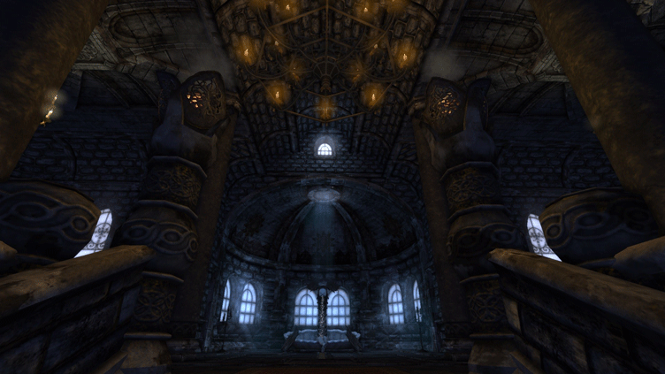
This depends on the kind of narrative being evoked. Some games might want to focus on a sense of momentum and velocity, for instance. That velocity can be mitigated depending on the type of experience that is desired. For example, if we use Frictional Games’s Amnesia: The Dark Descent, the panic-state (due to the darkness/madness) coupled with the offending entity, then the hiding, calls for a slow momentum in gameplay. What kind of character is our nameless protagonist? Since we’re looking to our players to inhabit this entity, it helps to have a Persona developed that helps to dictate the rest of the user-flow. Even though this nameless protagonist may not have any personal expression in the world, it can create opportunities for nuanced gameplay that creates a deeper mystery (that may never be explored, but can be hinted at), an example of this is Reflect Studios’s Welcome to the Game II where the protagonist is a reclusive deep-web user in an apartment infested with “disturbances”. Narrative journeys create deeper immersion compared to functional adventures. Certain games will want to take a more aloof and surreal approach to a Persona, but a gameplay system anchored by a Persona can make a world of difference when it comes to figuring out what is and isn’t necessary to tighten that velocity.

Amnesia: The Dark Descent
Do you think having a quick select hotkey on top of a traditional inventory is the best method for moving through quick puzzles and multiple items?
A quick-select system is the most useful if the player recognizes the usage of the item. Like if it were a health kit, a flashlight, a defense-oriented, and/or attack-oriented item. If it offers a trusted or tested utility, a quick-select system is a reliable format. In conjunction with this, it does mean that the should game pause or slow down, to allow players time to make a decision over what item is to be used or tried. Keeping the scenery in front of the player is important to remind and contextualize their decision-making, so it helps if the inventory screen doesn’t dominate the visual space for the player. This doesn’t mean that you should have the inventory up at all times, as an uncluttered interface is better for adventure experiences. Quick-select inventory is great for action-oriented games, as I will mention in the next response, but the usage of a quick-select inventory system is highly dependent on the narrative and particularly the advised creation of a persona which can augment the consideration of these gameplay systems.
Do you think a selection wheel would be faster and more intuitive for players solving these kinds of puzzles?
In my experience, there are two key elements to items in conjunction to quick-select systems, that is:
- Native recognition of function (like a gas mask, which we know is used in gas areas),
- Impact relationship to the surroundings (the crowbar, stereotyped by Valve’s Half-Life, where the crowbar can be used on everything and the environment reacts to it).
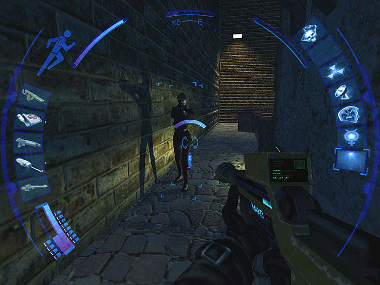
An example of this are games like Deus-Ex 2: Invisible War HUD with the quick-select wheel. There’s some kind of immediate impact or effect when selections are activated, which is why we often see it in action games which require immediate decision-making in often intense situations. There are games that do away with quick selection systems, maintaining that players only have a few items on their person at any given time, so an item-swap mechanic takes place of a wider inventory management system. Then, question becomes: “Is a selection wheel more intuitive?” Whether it is or isn’t depends on how those slotted items are treated within the interface and the item’s impact in its usage within the game. For example, if the Item ABC and Item XYZ are swapping within the same slot as a piece of armor might, they can sit at the upper part of the selection wheel because we recognize their use and impact on the game. If the item is more obscure, something with more specific and nuanced use, there needs to be some consideration on how they impact usability based on its placement within the wheel and how its being used or experimented with.

Deus Ex: Invisible War
How do you feel about automatically equipping items based on gameplay circumstances?
Designers always need to be careful about gameplay automation, as it is still desirable to have player expression in the gameplay. One of the largest failings in games (mostly seen in MMO’s like Blizzard’s World of Warcraft: Battle for Azeroth) is when a system is too automated to the point where you can run through things blindly. Funnily enough, I just recommended doing this with the crowbar, having it only be pulled up when a particular situation is present. This is why I want to be careful about automation. Friction is a valuable part of gameplay; not the friction itself (at least not anymore), but the context of that friction. Here’s my thought:
We can look to old adventure games for insight, like LucasArt’s Monkey Island, or Sierra On-Line’s King’s Quest series and Quest for Glory. One important thing about adventure game puzzles is feedback and experimentation. There were several scenarios in classic adventure games where an item can be used in a situation and it totally works in the moment (thus losing it after usage), but fails in the long-term because a latter situation would have better suited that item I had already lost. In other attempts with an item, the game would respond to my attempts to use the item on an interactive situation. For example, if I used the crowbar to break glass covering an alarm I’d like to trigger, a message saying “That doesn’t seem to break the glass. Strange.” is an important response that gives feedback, a voice, and context, to the usage of an item (as much as the player’s character).
How would you feel about limiting the player’s active inventory to something very small, like 3 slots?
This can definitely create a lean experience for players. Lean, meaningful, impactful. Less inventory management helps to lessen confusion and cognitive load when dealing with intense and/or complicated situations.
What about limiting puzzles to single-item or single-loadout solutions?
You can, but there’s something fun about experimenting with different items. There’s a satisfaction when a trying puzzle has its perfect fit. For example, I might face a puzzle with two solutions, one that requires a consumable and one that doesn’t. Obviously, solving the puzzle without losing a consumable item is valuable and so giving the player an ability to learn both inefficient and efficient solutions to puzzles allows you to reward that kind of experimentation. Replayability can be hard to find in puzzle games, but this kind of layered efficiency means that there’s still more for me to discover even if I’ve progressed past this puzzle before. I don’t know if anyone played this game, but Team Salvato’s Doki Doki Literature Club had this pseudo-replayability which left a strong impression on players, to the point where the game became a cultural phenomenon. But in regards to experimentation, I want to point out that this works best if there’s contextual feedback to those attempts. Not just denial sounds, but a text (or vocal) narrative to those attempted experiences.
We hope any and all of you have found JB’s insights helpful! If you’d like to know more about him, feel free to visit his website portfolio here. If you’d like to give us your thoughts on user experience design, how it helped your development or anything in between, please feel free to follow us on Twitter, Facebook, Instagram and join our Discord!

[…] our grand tradition of featuring games industry experts on the Akupara Blog, today’s entry is brought to you by Cat […]